Core Values in Focus: M&C Saatchi’s revamped office design
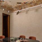
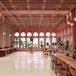
In the recent redesign of M&C Saatchi’s Melbourne workplace, the creative agency’s core values of connection, change, and simplicity shine through in every aspect of the space.
Known for their seamless brand consistency, M&C Saatchi’s new office reflects their modern, tech-leaning ethos while prioritising functionality and intentional restraint.

GALLERY
Through a collaborative workshopping phase, the design team honed in on brutal simplicity, guided by a clean, grid-driven layout. This structured approach offered a bold canvas for creative expression, allowing for distinct “moments” of colour, texture, and finish. The result is a minimally built form that encourages connection and serendipitous encounters, mirroring the company’s commitment to cultural and commercial cohesion. Designed almost boundary-free, the space is unified by material choices, abundant natural light, and an organic flow that invites both creativity and focus.
In their pared-back approach, designers embraced existing structural elements where possible, avoiding unnecessary renovations to enhance both environmental and budgetary efficiency. A standout feature of this approach is the ceiling, where existing white tiles were removed, re-used in other building fit-outs, and replaced with a muted green finish beyond the grid. This subtle colour—intentionally understated—captures the balance of restraint and refinement that defines M&C Saatchi’s brand, creating a contrast with the raw construction materials that ground the design.
Mitchell Jones, Creative Director of Made For, the studio behind the design, explains, “We wanted to nail this combination between sleek and modern, balanced with pared-back, raw elements – we felt like that captured the essence of what the M&C Saatchi Melbourne team were.” The office incorporates refined elements, like bold-toned upholstery and di-chromatic window film, balanced by translucent corrugated sheeting to frame murals. Together, these materials create a space that is both tech-savvy and warmly inviting, embodying M&C Saatchi’s creative yet approachable identity.
This workplace redesign exemplifies how values can shape an environment, establishing a visually cohesive yet deeply functional space. The result is an office that resonates with M&C Saatchi’s ethos and purpose, illustrating the power of simplicity and subtlety in workplace design.
Images by Cheyne Toomey via ArchDaily
Luxury brand Bottega Veneta has teamed up with Italian lighting specialists Flos to recreate Gino Sarfatti’s iconic Model ...
Studio Bloom have designed the Sunita Shekhawat flagship store, located in Jaipur's first Museum of Meenakari. The design of the build ...
Creating an office that caters to the fluid nature of modern 9-5s whilst incorporating infrastructure that creates an ...
When it comes to quality commercial interiors, the first thought that comes to mind is rarely transport. But ...
The Longfellow Hotel in Portland, Maine, takes inspiration from the New England coast’s ever-changing climate and rugged beauty. ...


